
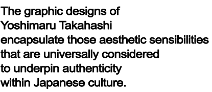
These elements include offering a subtlety and profoundness to whose existence is attached a certain quality of silence; profiles that are both elegant in terms of their moistness and softness; a fragility that is not impervious to the ravages of time; wabi-sabi aesthetics that cherish the duality of rust and decay; grace and delicacy that project feelings redolent of writing; and minimalist, indirect expressionism that entrusts artistic interpretation to recipients of artistic messages. At the same time, however, Takahashi has never allowed his work to merely rehash stereotypical and outworn Japanese design styles. Rather, through leveraging reconstruction and sublimation to gently expose to the rigors of modernism a traditionalist beauty inherited from time in memoriam, and through melding such to a construct of modernity, Takahashi successfully applies expressionist paradigms to his work, the messages therein awakening a cultural identity within Japanese people who experience them.
On the surface, Takahashi's designs project both silent beauty and strength. Subliminally, however, the anguish and struggle within creative processes is often apparent. The determination of the artist is also seen, him striving for a sense of universal beauty while simultaneously remaining well-grounded in graphic expressionist principles.

Yoshimaru Takahashi describes his views regarding design using the term, “FUZZY COMMUNICATIONS.”
He theorizes that communication is the most important element of design. Even so, however, the manner in which identical messages are communicated can differ, being much dependent on the cultural values of the message sender and recipient. Based on a belief that a better understanding of his own identity represents an integral element with regard to his ability to communicate, Takahashi explores based on both objectivity and systematic-comprehension, the cultural identity and aesthetics he employs as the basis of his work, such being derived from his Japanese heritage.
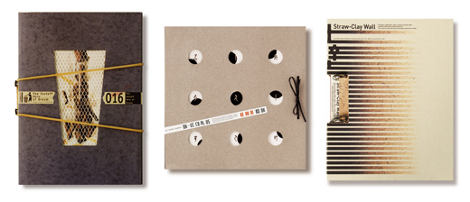
As a result of such self-discovery, Takahashi has been able to define eight keywords with regard to his work: “Texture” represents something experienced when coming into contact with objects. “Weathering” describes the beauty found within processes of decay. "Wildness" is a vehicle that incorporates nature into daily life. "Simulation" views the artificial as natural through a disregard of intended purpose. “Flat plane" transforms how two-dimensional works such as animation or manga are perceived as three-dimensional. "Kekkai" (a system of orderly borders) consciously divides space, examples being noren (split curtains that hang in the doorways of Japanese stores), and sudare (a form of Japanese screen). “Obscurity" is something that seeks out delight from among ambiguity. “Mixture" retains an overall sense of balance through including the miscellaneous.
In his mind, Takahashi further classifies these keywords into three genres: "Texture," "Spatiality," and "Emotion." Through overlaying such upon one another, he conceptualized the non-resolute, which in turn, he calls "FUZZY COMMUNICATIONS." Within this construct, Takahashi finds beauty in indirect rather than straightforward expressionism. Leveraging these processes, subliminal content is created, the interpretation of such being left to a viewer’s imagination.

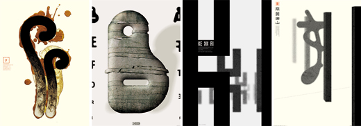

Takahashi's style could also be described as "design through abandonment."
The process he uses in evolving design expressionism is somewhat self-denigrating in that new expressionist forms are created through purposefully relinquishing past strengths, and engaging in self-denial. Because during one stage of his career Takahashi displayed a willingness to employ authentic classical motifs from among Japan’s traditional performing arts such as Noh and Kyogen, this work was often regarded as personifying the wa (peaceful) principles of traditional Japanese design. Takahashi, however, did not appreciate this stereotyping. He felt he was unable to find what he was truly searching for based on such superficiality. This dissatisfaction led Takahashi to relinquish his use of classical Japanese motifs, him preferring to continue searching for more profound expressionist forms. He consciously decided to discard the visual symbolism that had resulted in the success of his past work.
Rather, Takahashi successfully strived to add a new texture to his designs. This was a texture that possessed deeper, more expressive qualities, such being derived from the earth, the trees, stones, and other natural materials, all of which are indelible elements within the environment, lifestyle, and culture of Japan. He focused on the texture of these materials, indirectly applying them to designs in preference to the usage of more traditional motifs.
At one point, Takahashi even attempted to shift his design expressionism to something more “international” and avant-garde, through completely eliminating all Japanese elements from his work. He soon realized, however, that in modern society where information is delivered real-time, being international no longer means Westernization. Rather, it requires designers to study and discover identity within their own culture. Takahashi decided retrace his footsteps and he began his quest to find a true Japanese cultural identity. This was the beginning of his challenge to realize a sense of originality within his designs.
At the end of 2008, Takahashi published EMOTIONAL TYPOGRAPHY, in which he abandoned natural element textures and instead applied "Flat plane” and "Simulation," two of his eight keywords. In this work, he emphasized flat surfaces and designed typefaces that resembled rainfall, successfully expressing emotives via linguistic symbols. Shinnosuke Sugisaki, a Takahashi contemporary, rival and friend, called this work a "successful acquisition of expressionism that leverages the flat plane, a concept originally shared by Japanese anime and manga that is now globally recognized."
In other words, Takahashi finally obtained “FUZZY COMMUNICATION” through removing Japanese motifs, natural textures, and direct expressionism in order to realize indirect expressionism.
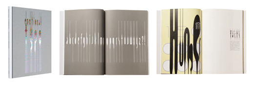
"EMOTIONAL COMMUNICATION"
Takahashi designed letters to describe rainfall in an attempt to deliver expressionism and emotives while preserving the rationality of typefaces.
He depicted the different look and feel of rain, from drizzle through to downpour, by enhancing the lines within his work.
Yukimaru Takahashi from "Bunkajin"
"http://bunkajin.jp/bunkajin/person/takahashiyoshimaru/"


